4 Logo Variations Every Brand Identity Needs
When most people think of a brand, they think of a logo. However, a brand is not a logo. A logo is one visual expression of your brand, but not the entirety of it.
You may think you only need one main logo to represent your brand, but you'll quickly realize you need quite a few others after trying to implement that single design.
DIY designs or requesting a single logo from a designer just doesn't cut it. If you want your business to show up and stand out with a brand that books, you need a set of four core logo variations.
Throughout your search for a brand designer, you’ve most likely come across terms like “submark” and “alternate logo” listed in a branding package. Then walked away a bit confused about what the designer was talking about; let alone what those logos look like!
Today, I’m demystifying the “designer-speak” and simply explaining the four different logo variations (with visual examples) that every brand needs to complete its brand identity.
What’s a Logo Variation?
First, a logo variation does not mean you have wildly different visual designs for every logo.
A logo variation is a rearranged version of your primary logo design that gives your brand the flexibility to show up consistently, and recognizably, in different placements.
Every brand needs a set of unique logo designs to use on several platforms that are recognizable, versatile, and complement its overall identity.
For example, if you only have one large-and-in-charge horizontal logo, how will it work as the profile photo on your social media business page?
If you only have a small circular logo, what will you use for your website’s header?
What about business cards? Thank you cards? Letterheads? Merch/swag?
(You get the picture I’m painting here).
Logo variations can include a range of colors, sizes, and formats, but there are four main logo variations every brand needs. A brand identity designer should design at least four non-negotiable logo variations to help your brand show up and look consistent no matter where you place it.
Let’s take a look at each of the different logo variations your brand needs.
4 Different Types of Logo Variations
01. What is a primary logo?
A primary logo is the main logo used to represent your brand. All other brand logos stem from this primary logo design.
Primary logos are typically horizontal, and the most comprehensive of all brand designs. Any tagline(s), established dates, illustrations, icons, locations, etc., usually make their way into this grandeur logo.
Your primary logo design needs lots of space because of its intricacies and size. Use your main logo in places where it has plenty of room to breathe and isn’t restricted by space.
Placements: Desktop website header, large print collateral (e.g., signs).
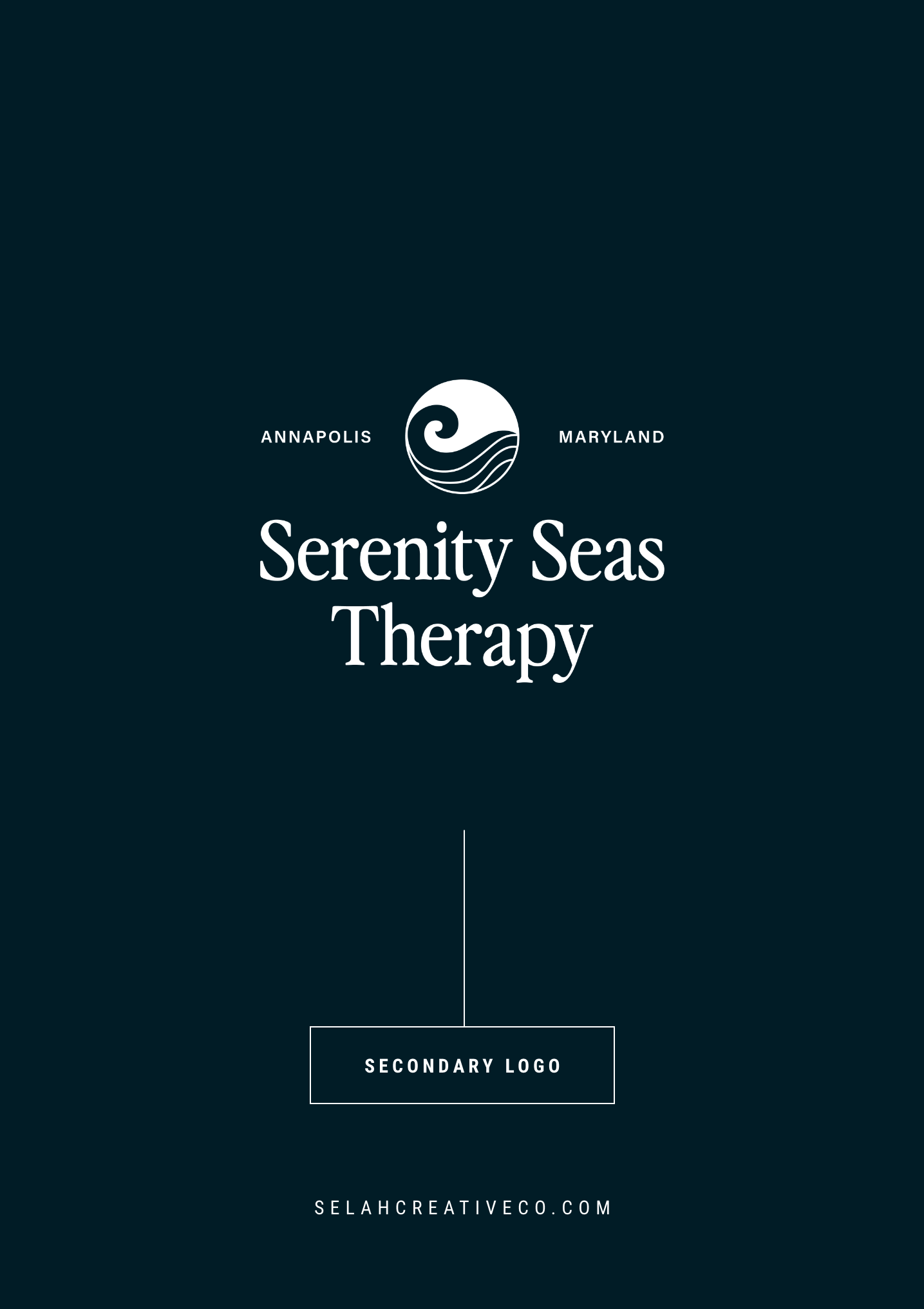
02. What is a secondary logo?
Depending on your industry, a secondary logo can be vertical or horizontal. Alternate secondary logos tend to be stripped-down, stacked versions of your primary logo.
Your secondary logo is also known as an alternate logo. Think of it in terms of sports: If my primary player were out due to an injury (e.g., your primary logo can’t fit in the desired location), I’d put in an alternate.
I tend to remove any creative elements or taglines from secondary logo designs and focus on the brand name (also known as a wordmark logo).
A vertical secondary logo works well on hang tags for clothing brands, while a horizontal version is great for smaller print collateral pieces.
Placements: Business cards, invoices.
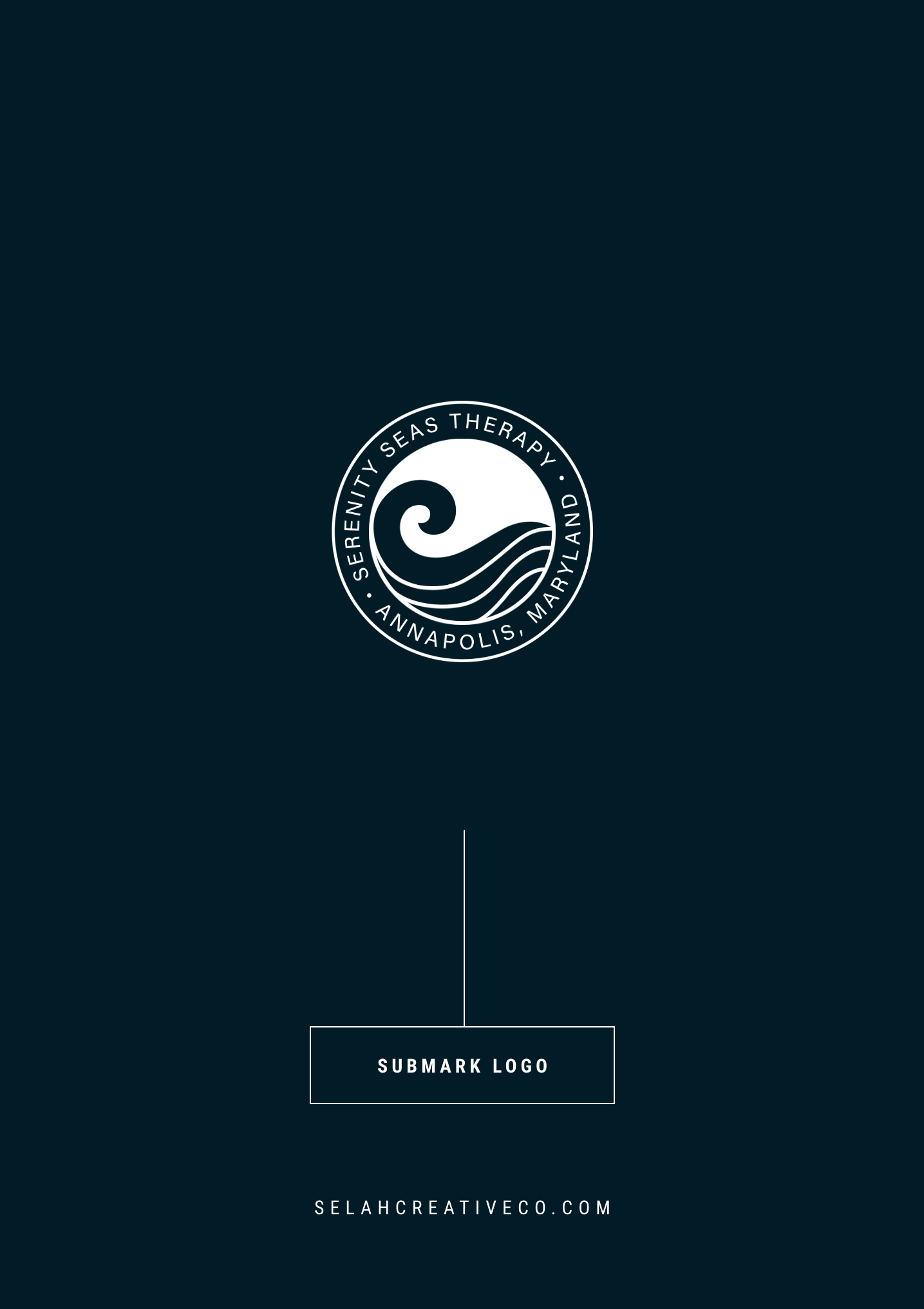
03. What is a submark logo?
Submark logos (also known as logo submarks, brandmarks, and alternate marks) are simple, small, but identifiable brand designs.
Some submark designs include the full business name and/or a creative element. If the submark only uses your brand’s initials, it’s known as a lettermark.
Submarks fit in condensed spaces where the larger logo variations won’t work.
It can be a challenge to size down a large primary logo into a tiny submark, but the result is an extremely versatile and creative logo variation!
Placements: Social media profile images, website footer, mobile website header.
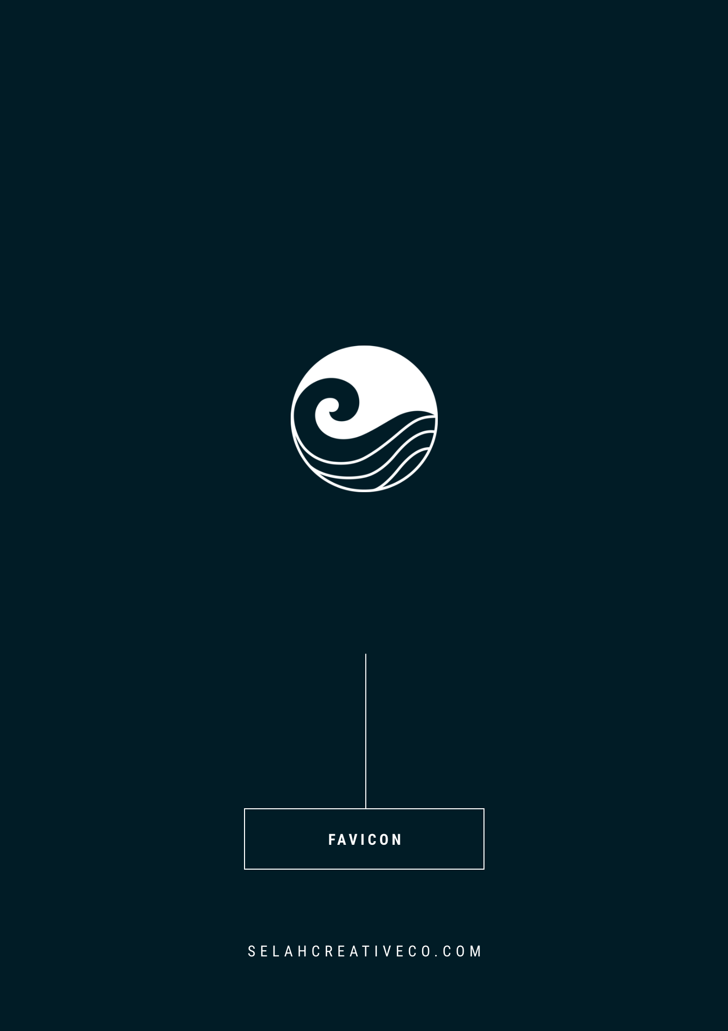
04. What is a favicon?
Favi-what? Fav-icon. Think, “icon.” Favicons are similar to submarks, but an even smaller design mark that only includes your brand initials OR a tiny illustration.
Usually, favicons go unnoticed (until they’re missing).
If you’re reading from a desktop, do you see the branded icons on the left of all the tabs you’ve got open on your browser window? Those are called favicons; typically a square or circular brand mini-mark.
A favicon serves one purpose: to provide a final branded touch to your website.
If a website doesn’t have a branded favicon, the website platform’s logo displays instead. For example, Squarespace will use its black box favicon on your website if you don’t upload your own, which just looks tacky.
Placement: Website browser tab.
Bonus: What are brand elements?
Brand elements support your brand identity but aren’t always logo designs. Examples of brand elements include illustrations, patterns, textures, and even brand photography.
Custom elements don’t use your brand name but may take an existing creative asset from your primary logo and use it to create a supportive design for your brand.
For instance, I used the illustrated willow leaf seen in Willow Bark Photography’s primary logo to create a brand pattern. A lettermark (brand’s initials) or monogram can also be used to create a brand pattern.
A good rule of thumb is not to overwhelm your ideal clients with lots of logo variations and brand elements. If you have an illustration in your logo, use it to create one distinct brand element (pattern). Choose one form of brand photography with a specific preset and stick with it.
Placements: Website backgrounds, social media, print collateral (e.g., tissue paper).
Your Brand Logo Basics Recap
Every brand element exists to play a supportive role in your brand identity—not distract from it.
In summary, here are the four logo variations your business needs for a better brand presence on multiple platforms:
Primary logo
Secondary logo
Submark/brandmark
Website favicon
Every business needs a holistic brand identity, not just a logo — a set of recognizable logo designs, a versatile color palette, some creative elements, and even a photography style to support the brand’s aesthetic.
But before you can even think about jumping into colors and typography, you need a brand strategy to guide your design decisions! Are you done searching, pinning, and stressing about how to brand or rebrand your business?
Fill out a client application to elevate your brand online and start booking the right clients today!
Keep learning: The Difference Between Brand Strategy and Brand Identity →

